
The goals
💪🏻Working with (Background) Images
✌🏻Understanding Flexbox & Grid
👍🏻 Diving Deeper Into Units
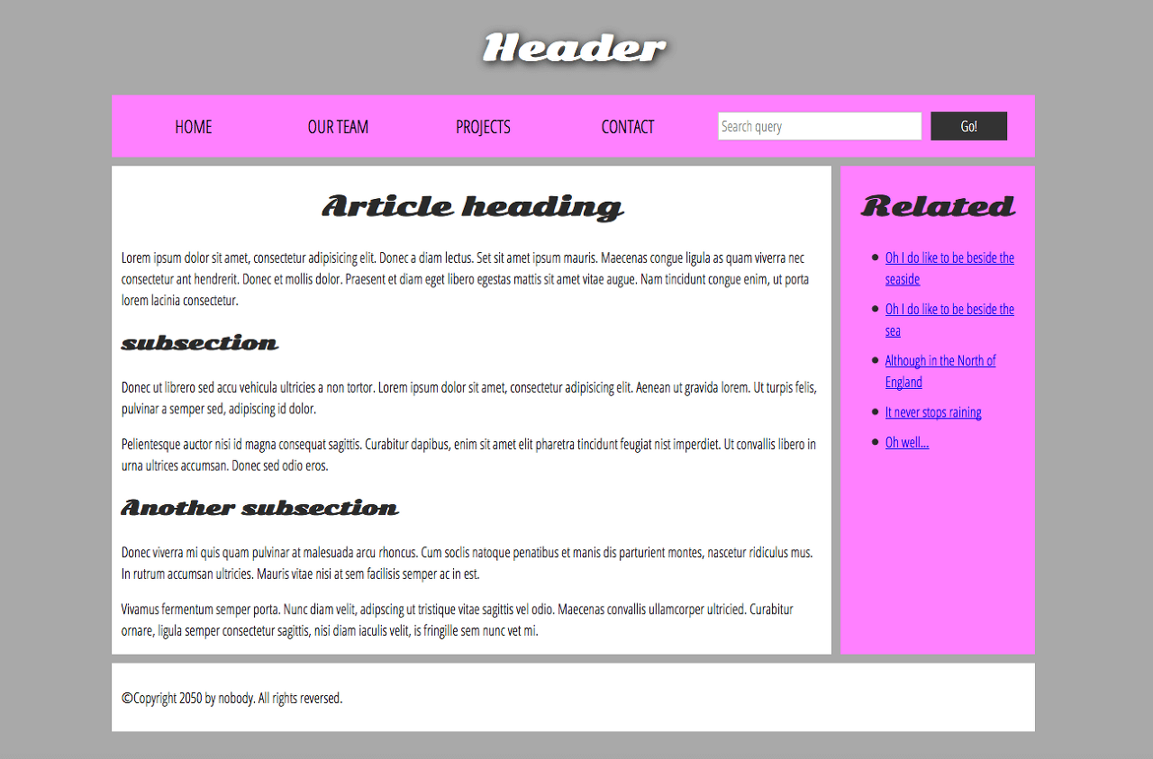
Basic sections of a document
Webpages can and will look pretty different from one another, but they all tend to share similar standard components, unless the page is displaying a fullscreen video or game, is part of some kind of art project, or is just badly structured:
header:
A strip across the bottom of the page that generally contains fine print, copyright notices, or contact info. It's a place to put common information (like the header) but usually, that information is not critical or secondary to the website itself. The footer is also sometimes used for SEO purposes, by providing links for quick access to popular content.
A "typical website" could be structured something like this:
Flexbox

flex-direction
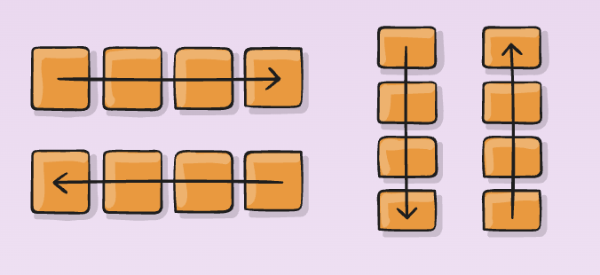
This establishes the main-axis, thus defining the direction flex items are placed in the flex container. Flexbox is (aside from optional wrapping) a single-direction layout concept. Think of flex items as primarily laying out either in horizontal rows or vertical columns.
.container {
  flex-direction: row | row-reverse | column | column-reverse;
}- row (default): left to right in ltr; right to left in rtl
- row-reverse: right to left in ltr; left to right in rtl
- column: same as row but top to bottom
- column-reverse: same as row-reverse but bottom to top
flex-wrap
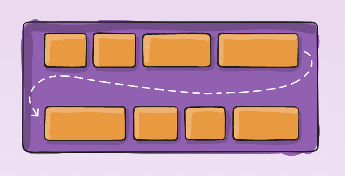
By default, flex items will all try to fit onto one line. You can change that and allow the items to wrap as needed with this property.
.container {
  flex-wrap: nowrap | wrap | wrap-reverse;
}- nowrap (default): all flex items will be on one line
- wrap: flex items will wrap onto multiple lines, from top to bottom.
- wrap-reverse: flex items will wrap onto multiple lines from bottom to top.
flex-flow
This is a shorthand for the flex-direction and flex-wrap properties, which together define the flex container’s main and cross axes. The default value is row nowrap.
.container {
  flex-flow: column wrap;
}
justify-content
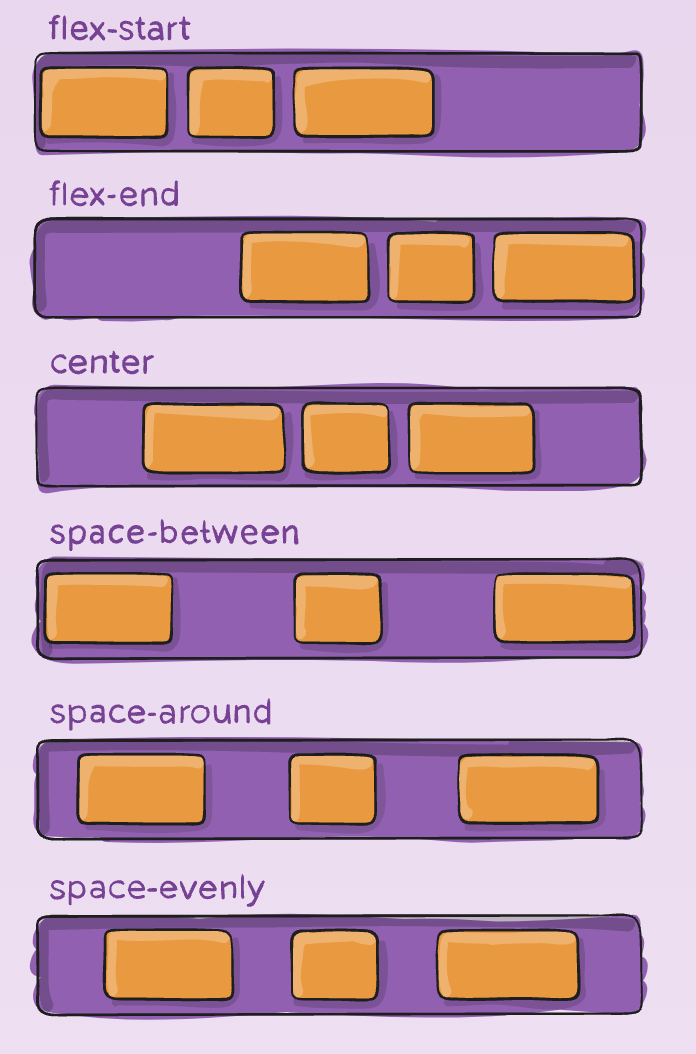
This defines the alignment along the main axis. It helps distribute extra free space leftover when either all the flex items on a line are inflexible, or are flexible but have reached their maximum size. It also exerts some control over the alignment of items when they overflow the line.
.container {
  justify-content: flex-start | flex-end | center | space-between | space-around | space-evenly | start | end | left | right ... + safe | unsafe;
}- flex-start (default): items are packed toward the start of the flex-direction.
- flex-end: items are packed toward the end of the flex-direction.
- start: items are packed toward the start of the writing-mode direction.
- end: items are packed toward the end of the writing-mode direction.
- left: items are packed toward left edge of the container, unless that doesn’t make sense with the flex-direction, then it behaves like start.
- right: items are packed toward right edge of the container, unless that doesn’t make sense with the flex-direction, then it behaves like start.
- center: items are centered along the line
- space-between: items are evenly distributed in the line; first item is on the start line, last item on the end line
- space-around: items are evenly distributed in the line with equal space around them. Note that visually the spaces aren’t equal, since all the items have equal space on both sides. The first item will have one unit of space against the container edge, but two units of space between the next item because that next item has its own spacing that applies.
- space-evenly: items are distributed so that the spacing between any two items (and the space to the edges) is equal.
align-items
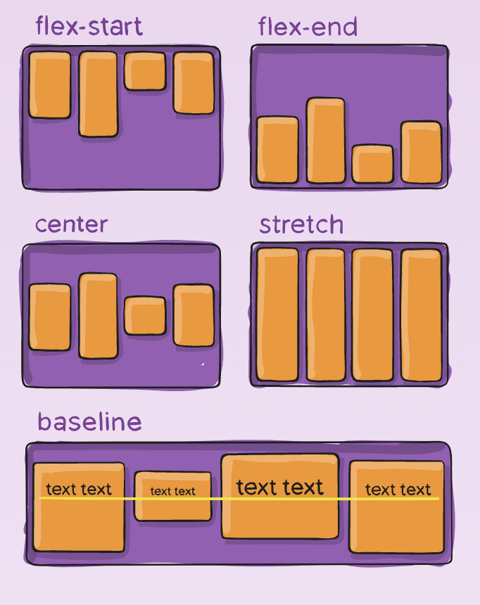
This defines the default behavior for how flex items are laid out along the cross axis on the current line. Think of it as the justify-content version for the cross-axis (perpendicular to the main-axis).
.container {
  align-items: stretch | flex-start | flex-end | center | baseline | first baseline | last baseline | start | end | self-start | self-end + ... safe | unsafe;
}- stretch (default): stretch to fill the container (still respect min-width/max-width)
- flex-start / start / self-start: items are placed at the start of the cross axis. The difference between these is subtle, and is about respecting the flex-direction rules or the writing-mode rules.
- flex-end / end / self-end: items are placed at the end of the cross axis. The difference again is subtle and is about respecting flex-direction rules vs. writing-mode rules.
- center: items are centered in the cross-axis
- baseline: items are aligned such as their baselines align
The safe and unsafe modifier keywords can be used in conjunction with all the rest of these keywords (although note browser support), and deal with helping you prevent aligning elements such that the content becomes inaccessible.
align-content
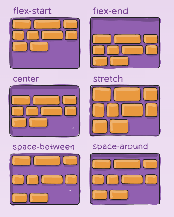
This aligns a flex container’s lines within when there is extra space in the cross-axis, similar to how justify-content aligns individual items within the main-axis.
Note: This property only takes effect on multi-line flexible containers, where flex-wrap is set to either wrap or wrap-reverse). A single-line flexible container (i.e. where flex-wrap is set to its default value, no-wrap) will not reflect align-content.
.container {
  align-content: flex-start | flex-end | center | space-between | space-around | space-evenly | stretch | start | end | baseline | first baseline | last baseline + ... safe | unsafe;
}- normal (default): items are packed in their default position as if no value was set.
- flex-start / start: items packed to the start of the container. The (more supported) flex-start honors the flex-direction while start honors the writing-mode direction.
- flex-end / end: items packed to the end of the container. The (more support) flex-end honors the flex-direction while end honors the writing-mode direction.
- center: items centered in the container
- space-between: items evenly distributed; the first line is at the start of the container while the last one is at the end
- space-around: items evenly distributed with equal space around each line
- space-evenly: items are evenly distributed with equal space around them
- stretch: lines stretch to take up the remaining space
Positioning
Values
- static: every element has a static position by default, so the element will stick to the normal page flow. So if there is a left/right/top/bottom/z-index set then there will be no effect on that element.
- relative: an element’s original position remains in the flow of the document, just like the static value. But now left/right/top/bottom/z-index will work. The positional properties “nudge” the element from the original position in that direction.
- absolute: the element is removed from the flow of the document and other elements will behave as if it’s not even there whilst all the other positional properties will work on it.
- fixed: the element is removed from the flow of the document like absolutely positioned elements. In fact they behave almost the same, only fixed positioned elements are always relative to the document, not any particular parent, and are unaffected by scrolling.
- sticky: the element is treated like a relative value until the scroll location of the viewport reaches a specified threshold, at which point the element takes a fixed position where it is told to stick.
- inherit: the position value doesn’t cascade, so this can be used to specifically force it to, and inherit the positioning value from its parent.
Absolute
If a child element has an absolute value then the parent element will behave as if the child isn’t there at all:
.element {
  position: absolute;
}
And when we try to set other values such as left, bottom, and right we’ll find that the child element is responding not to the dimensions of its parent, but the document:
.element {
  position: absolute;
  left: 0;
  right: 0;
  bottom: 0;
}
To make the child element positioned absolutely from its parent element we need to set this on the parent element itself:
.parent {
  position: relative;
}
Now properties such as left, right, bottom and top will refer to the parent element, so that if we make the child element transparent we can see it sitting right at the bottom of the parent:
Fixed
The fixed value is similar to absolute as it can help you position an element anywhere relative to the document, however this value is unaffected by scrolling. See the child element in the demo below and how, once you scroll, it continues to stick to the bottom of the page:
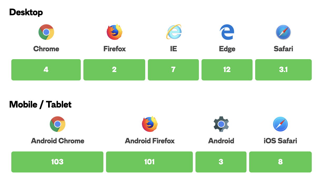
This browser support data is from Caniuse, which has more detail. A number indicates that browser supports the feature at that version and up.
Sticky
The sticky value is like a compromise between the relative and fixed values. As of this writing, it is currently an experimental value, meaning it is not part of the official spec and only partially adopted by select browsers. In other words, it’s probably not the best idea to use this on a live production website.
What does it do? Well, it allows you to position an element relative to anything on the document and then, once a user has scrolled past a certain point in the viewport, fix the position of the element to that location so it remains persistently displayed like an element with a fixed value.
Take the following example:
.element {
  position: sticky; top: 50px;
}
The element will be relatively positioned until the scroll location of the viewport reaches a point where the element will be 50px from the top of the viewport. At that point, the element becomes sticky and remains at a fixed position 50px top of the screen.
The following demo illustrates that point, where the top navigation is default relative positioning and the second navigation is set to sticky at the very top of the viewport. Please note that the demo will only work in Chrome, Safari and Opera at the time of this writing.
Box-sizing
The box-sizing CSS property sets how the total width and height of an element is calculated.
By default in the CSS box model, the width and height you assign to an element is applied only to the element's content box. If the element has any border or padding, this is then added to the width and height to arrive at the size of the box that's rendered on the screen. This means that when you set width and height, you have to adjust the value you give to allow for any border or padding that may be added. For example, if you have four boxes with width: 25%;, if any has left or right padding or a left or right border, they will not by default fit on one line within the constraints of the parent container.
The box-sizing property can be used to adjust this behavior:
- content-box gives you the default CSS box-sizing behavior. If you set an element's width to 100 pixels, then the element's content box will be 100 pixels wide, and the width of any border or padding will be added to the final rendered width, making the element wider than 100px.
- border-box tells the browser to account for any border and padding in the values you specify for an element's width and height. If you set an element's width to 100 pixels, that 100 pixels will include any border or padding you added, and the content box will shrink to absorb that extra width. This typically makes it much easier to size elements. box-sizing: border-box is the default styling that browsers use for the <table>, <select>, and <button> elements, and for <input> elements whose type is radio, checkbox, reset, button, submit, color, or search.
Object-fit
The object-fit CSS property sets how the content of a replaced element, such as an <img> or <video>, should be resized to fit its container. You can alter the alignment of the replaced element's content object within the element's box using the object-position property.
The object-fit property is specified as a single keyword chosen from the list of values below.
Values
contain
The replaced content is scaled to maintain its aspect ratio while fitting within the element's content box. The entire object is made to fill the box, while preserving its aspect ratio, so the object will be "letterboxed" if its aspect ratio does not match the aspect ratio of the box.
cover
The replaced content is sized to maintain its aspect ratio while filling the element's entire content box. If the object's aspect ratio does not match the aspect ratio of its box, then the object will be clipped to fit.
fill
The replaced content is sized to fill the element's content box. The entire object will completely fill the box. If the object's aspect ratio does not match the aspect ratio of its box, then the object will be stretched to fit.
none
The replaced content is not resized.
scale-down
The content is sized as if none or contain were specified, whichever would result in a smaller concrete object size.
Margin Collapsing (+α)
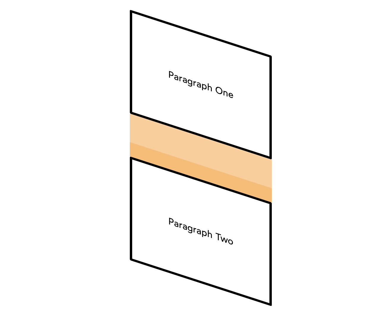
In CSS, adjacent margins can sometimes overlap. This is known as “margin collapse”, and it has a reputation for being quite dastardly.
Paragraph One
Paragraph Two
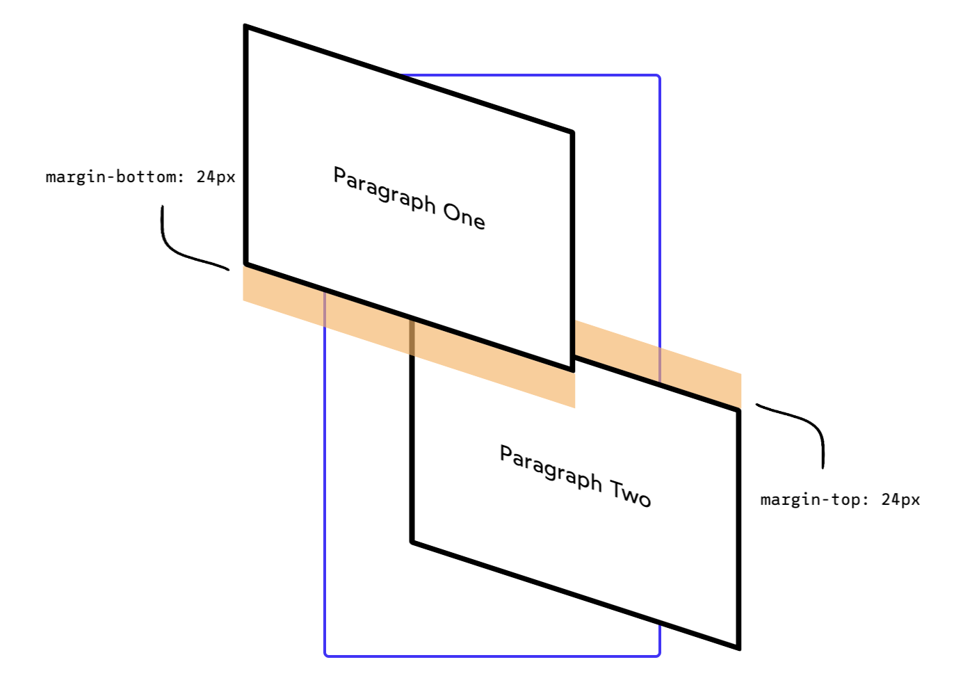
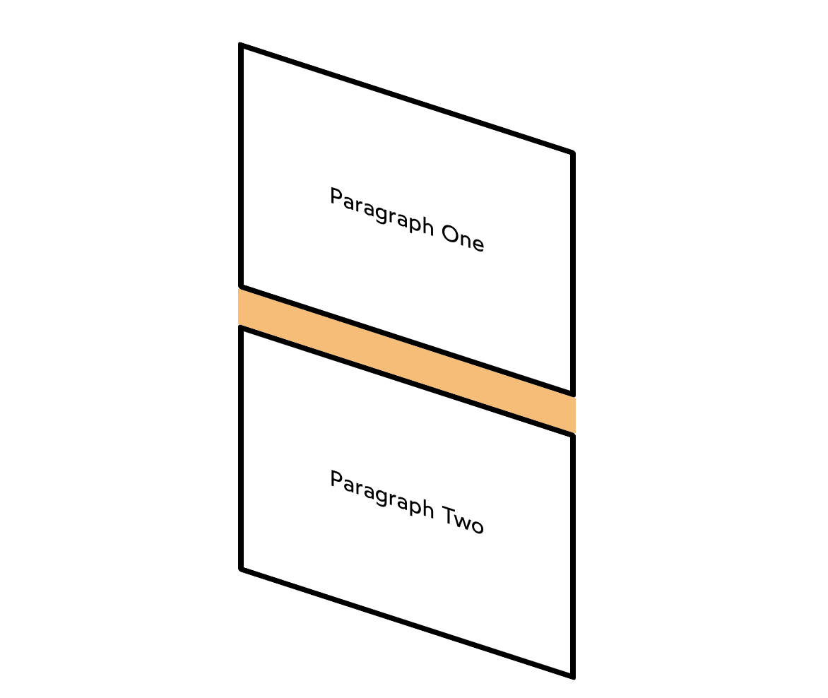
Instead of sitting 48px apart, their 24px margins merge together, occupying the same space!
This idea might sound simple, but if you've been writing CSS for a while, you've almost certainly been surprised when margins either don't collapse, or they collapse in weird and unexpected ways. In real-world projects, all kinds of circumstances can complicate matters.
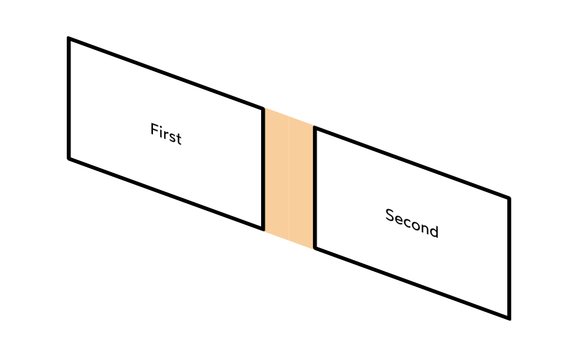
Only vertical margins collapse
When margin-collapse was added to the CSS specification, the language designers made a curious choice: horizontal margins shouldn't collapse.
In the early days, CSS wasn't intended to be used for layouts. The people writing the spec were imagining headings and paragraphs, not columns and sidebars.
So that's our first rule: only vertical margins collapse.

Only adjacent elements collapse
It is somewhat common to use the <br /> tag (a line-break) to increase space between block elements.
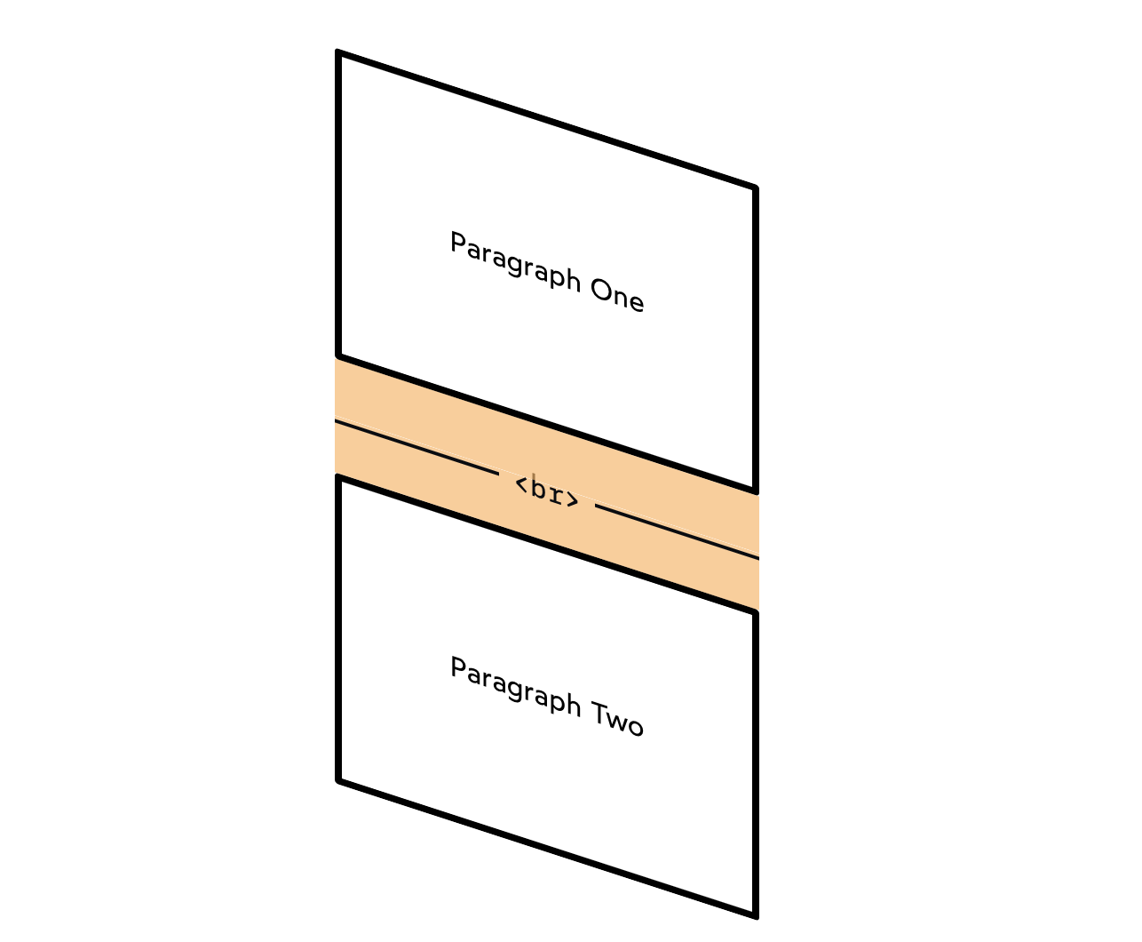
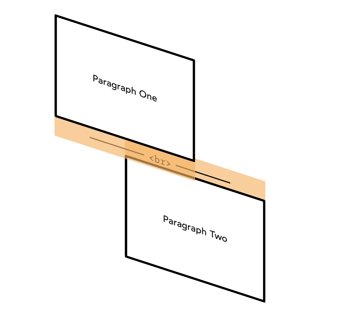
The <br /> tag is invisible and empty, but any element between two others will block margins from collapsing. Elements need to be adjacent in the DOM for their margins to collapse.
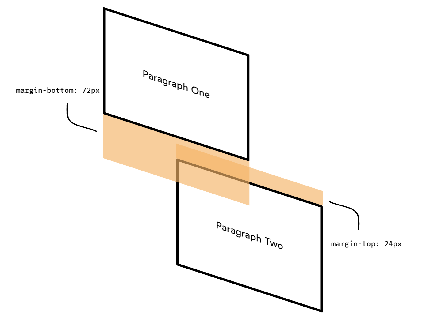
The bigger margin wins
What about when the margins are asymmetrical? Say, the top element wants 72px of space below, while the bottom element only needs 24px?
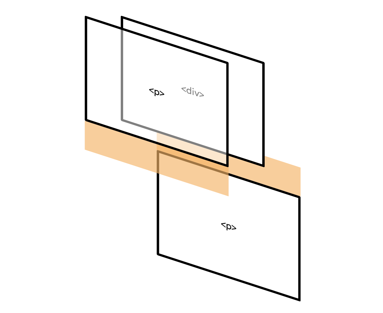
Nesting doesn't prevent collapsing
We're dropping our first paragraph into a containing <div>, but the margins will still collapse!
Margins can collapse in the same direction
So far, all the examples we've seen involve adjacent opposite margins: the bottom of one element overlaps with the top of the next element.
Surprisingly, margins can collapse even in the same direction.
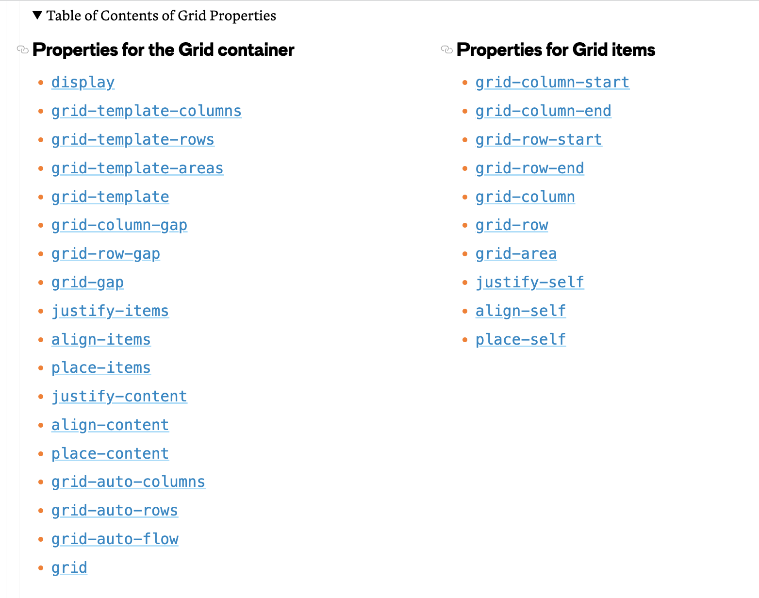
CSS Grid
CSS Grid Layout (aka “Grid” or “CSS Grid”), is a two-dimensional grid-based layout system that, compared to any web layout system of the past, completely changes the way we design user interfaces.
CSS tips
*When we import CSS file, it's more common to import commonly used CSS file first, and then specifically used file as next.
* When we use border-radius, it shouldn't go to pseudo-selector, it should apply to the original selector of it, so if there's another chance to show this item still this border-radius can appear.
*If we want some specific position for an item, we can use grid to have some full control for layouts
*We can use Unicode directly with '&#x' (hexadecimal unicode)
=> https://en.wikipedia.org/wiki/Arrows_(Unicode_block)
Arrows (Unicode block) - Wikipedia
Unicode block Unicode character block ArrowsRangeU+2190..U+21FF(112 code points)PlaneBMPScriptsCommonAssigned112 code pointsUnused0 reserved code points1.0.0 (1991)91 (+91)3.0 (1999)100 (+9)3.2 (2002)112 (+12) Code chartNote: [1][2] Arrows is a Unicode blo
en.wikipedia.org
Sources
Document and website structure - Learn web development | MDN
At this point, you should have a better idea about how to structure a web page/site. In the last article of this module, we'll learn how to debug HTML.
developer.mozilla.org
https://css-tricks.com/snippets/css/a-guide-to-flexbox/
A Complete Guide to Flexbox | CSS-Tricks
Our comprehensive guide to CSS flexbox layout. This complete guide explains everything about flexbox, focusing on all the different possible properties for the parent element (the flex container) and the child elements (the flex items). It also includes hi
css-tricks.com
https://css-tricks.com/almanac/properties/p/position/
position | CSS-Tricks
The position property can help you manipulate the location of an element, for example:
css-tricks.com
https://developer.mozilla.org/en-US/docs/Web/CSS/box-sizing
box-sizing - CSS: Cascading Style Sheets | MDN
The box-sizing CSS property sets how the total width and height of an element is calculated.
developer.mozilla.org
https://developer.mozilla.org/en-US/docs/Web/CSS/object-fit
object-fit - CSS: Cascading Style Sheets | MDN
The object-fit CSS property sets how the content of a replaced element, such as an <img> or <video>, should be resized to fit its container.
developer.mozilla.org
https://www.joshwcomeau.com/css/rules-of-margin-collapse/
The Rules of Margin Collapse
“Margin collapse” has a dastardly reputation, one of the trickier parts of CSS. Fortunately, it gets a lot easier once you learn a few rules! In this tutorial, we take a deep dive into the governing principles, and learn how to use them to our advantag
www.joshwcomeau.com
https://css-tricks.com/snippets/css/complete-guide-grid/#prop-display
A Complete Guide to Grid | CSS-Tricks
Our comprehensive guide to CSS grid, focusing on all the settings both for the grid parent container and the grid child elements.
css-tricks.com
https://academind.com/tutorials/the-position-property
The Position Property
The position property allows us to change the position of elements on our website. No big news, but depending on the value applied to this property, the element behaviour changes.
academind.com
https://academind.com/tutorials/flexbox-basics-container/
Flexbox: Basics & Container
Responsive design is more important than ever as we want to ensure that our website looks awesome on all devices. With Flexbox we can make our Elements more dynamic, so let's find out how this works!
academind.com
https://academind.com/tutorials/flexbox-flex-items/
Flexbox: Flex-Items
Understood the Flex-Container? But what if we want to change the way specific Flex-Items are displayed, it that possible? Yes it is!
academind.com
https://academind.com/tutorials/css-grid-vs-flexbox/
CSS Grid vs Flexbox
CSS Grid or Flexbox, which one should you use? A lot of developers use both incorrectly. Here's why you won't.
academind.com
'2022 Web Development Bootcamp' 카테고리의 다른 글
| Section 09: Designing Beautiful Websites - Some Helpful Tricks (0) | 2022.08.17 |
|---|---|
| Section 08: Understanding Responsive Design (One Website - Different Devices) (0) | 2022.08.17 |
| Section 06: Git & GitHub (0) | 2022.08.10 |
| Section 05: Hosting Our First Website! (0) | 2022.08.09 |
| Section 04: HTML & CSS Basics: Summary & Practice (0) | 2022.08.09 |