
The goals
💪🏻React Core Syntax & JSX
✌🏻Working with Components
👍🏻Working with Data
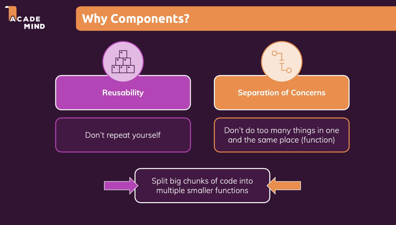
What Are Components? And Why Is React All About Them?
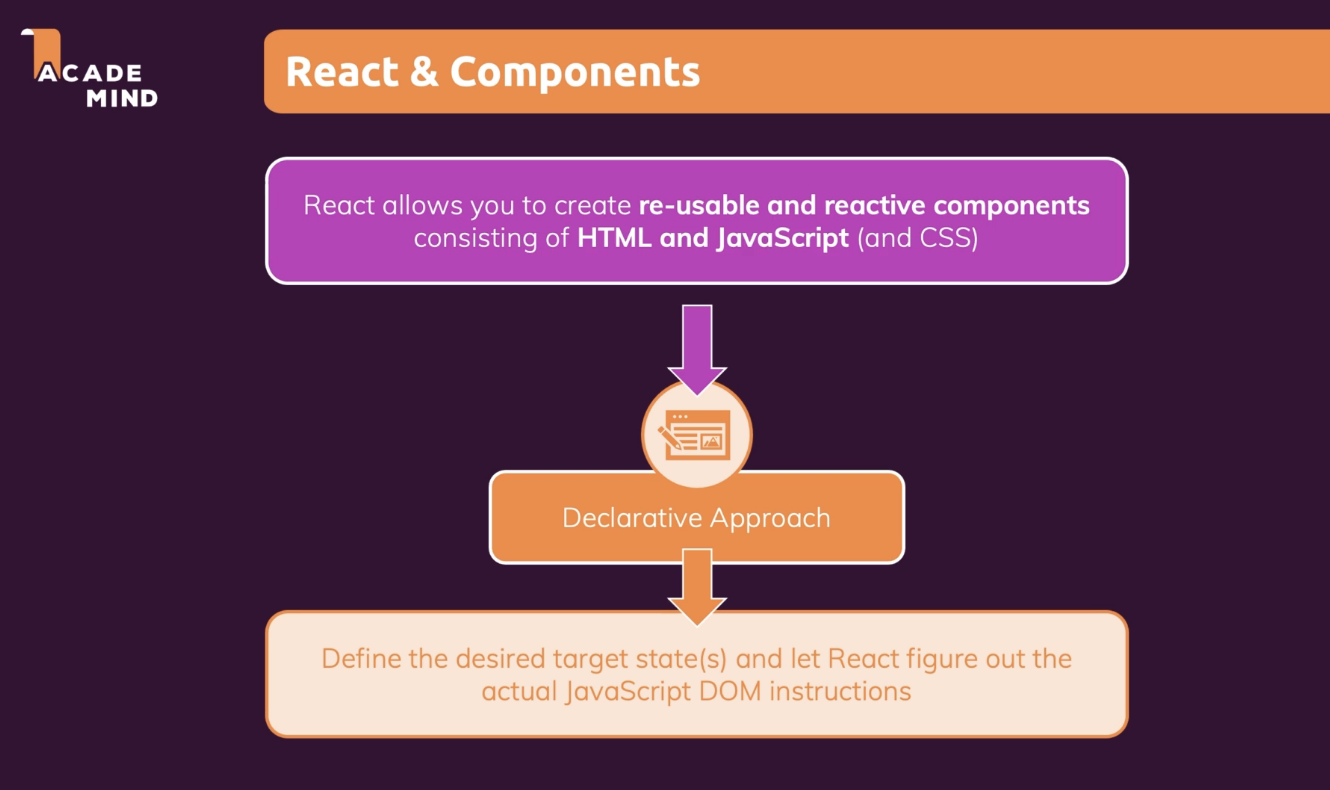
React is a JavaScript library for building user interfaces
HTML, CSS & JavaScript are about building user interfaces as well
React makes building complex, interactive and reactive user interfaces simpler
React is all about "Components"
-Because all user interfaces in the end are made up of components
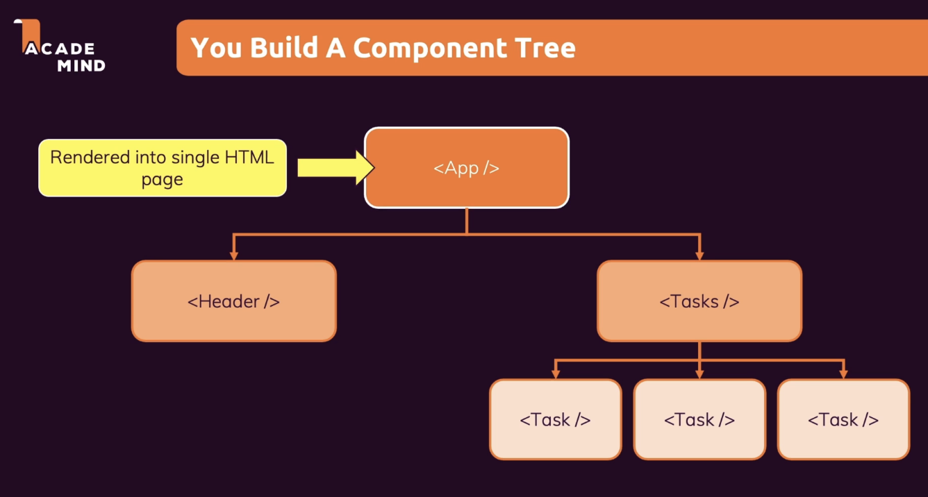
If we start codes, index.js file will be read first.
We have only one index.html file because it's SPA.
cf. <div id="root"></div>
JSX

We use 'className' not just 'class'!
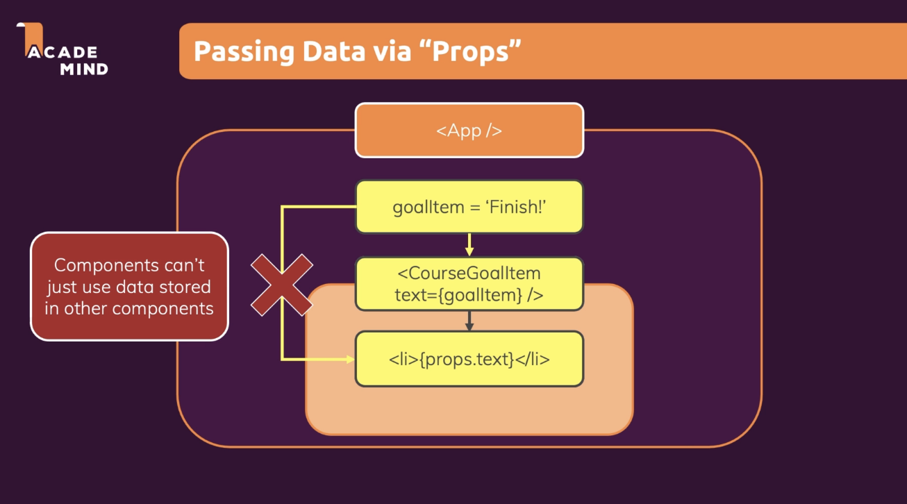
React Props
props stands for properties.
Props are arguments passed into React components.
Props are passed to components via HTML attributes.
React Props
React Props are like function arguments in JavaScript and attributes in HTML.
To send props into a component, use the same syntax as HTML attributes:
Example
Add a "brand" attribute to the Car element:
const myElement = <Car brand="Ford" />;The component receives the argument as a props object:
Example
Use the brand attribute in the component:
function Car(props) {
  return <h2>I am a { props.brand }!</h2>;
}
Composition
Building a card component
function Card({ image, headerText, range }) {
  return (
    <div className="card">
      <div className="card-header">
        <div className="card-image">
          <img src={image} alt={image} />
        </div>
        <h1 className="card-header-text">{headerText}</h1>
      </div>
      <div className="card-progress">
        <div className="card-progressbar">
          <ProgressBar range={range} />
        </div>
        <h3>The range is {`${range}%`}</h3>
      </div>
    </div>
  );
}
Great! The card component does its job well and is well structured. Everyone is happy and went by calling the card component. Easy life!
Let’s imagine after a month, a teammate writes to me and says the following.
Hey Tife, I discovered the card component while going through the docs and it is great. It serves my use-case with a “little modification”. I want the card header rendered before the card image, can you build this specific use-case? Thanks, you are the best!
A common approach would be my writing back saying;
Hey John Doe, sure! I will add a props to handle this case.
Then I would do something like this.
function Card ({ image, headerText, range, renderHeaderFirst }) {
  return (
    <div className="card">
      {renderHeaderFirst ? (
        <div className="card-header">
          <h1 className="card-header-text">{headerText}</h1>
          <div className="card-image">
            <img src={image} alt={image} />
          </div>
        </div>
      ) : (
        <div className="card-header">
          <div className="card-image">
            <img src={image} alt={image} />
          </div>
          <h1 className="card-header-text">{header}</h1>
        </div>
      )}
      <div className="card-progress">
        <div className="card-progressbar">
          <ProgressBar range={range} />
        </div>
        <h3>The range is {`${range}%`}</h3>
      </div>
    </div>
  );
};
A single prop and the required use case are met, and our teammate can use the component.
Let’s imagine, after some months, there was another “little modification” required by a teammate to move the range text before the progress bar, and probably for this use-case, he wants to hide the header text.
Following the above approach, we will add another prop and do many conditionals to satisfy this use case.
You can quickly see how fast we have moved away from how our component was envisioned to work, and now, it is becoming much messier. Before we know it, we have this monster component nobody wants to work with or fix any bug on.
Instead of unnecessary props or irrelevant conditionals, I would suggest a better approach—component composition.
We can build certain building blocks and allow the user to determine how they want to structure their layout.
Let’s refactor our Card component to serve more use-cases.
function Card({ children }) {
  return <div className="card">{children}</div>;
}

function CardImage({ image }) {
  return (
    <div className="card-image">
      <img src={image} alt={`card-${image}`} />
    </div>
  );
}

function CardHeaderText({ headerText }) {
  return <h1 className="card-header-text">{headerText}</h1>;
}

function CardProgress({ children }) {
  return <div className="card-progress">{children}</div>;
}

export { Card, CardHeaderText, CardImage, CardProgress };
Now, what we have are building blocks, nothing is coupled together, and we can easily build our layouts to fit our use-cases.
For example, remember John Doe's requirement to move the card header text before the image? Well, he wouldn’t have to write me that lovely but sad message. Because now, happily, we have a better, extendable, and reusable component.
Let’s see it.
import React from "react"
import image from "./image.jpeg"

function CardUsecase1() {
  const range = 200; //some calculation to determine range

  return (
    <div>
      <Card>
        <CardHeader headerText="My header text" />
        <CardImage image={image} />
        <CardProgress>
          <ProgressBar range={range} />
          <h3>The range is {`${range}%`}</h3>
        </CardProgress>
      </Card>
    </div>
  );
}
That’s all!
We can do this if we have a use-case repeatedly used by creating another component from the Card building blocks and giving anyone else who needs to use the building blocks to build their use case.
For example:
function Card({ children }) {
  return <div className="card">{children}</div>;
}

function CardImage({ image }) {
  return (
    <div className="card-image">
      <img src={image} alt={`card-${image}`} />
    </div>
  );
}

function CardHeaderText({ headerText }) {
  return <h1 className="card-header-text">{headerText}</h1>;
}

function CardProgress({ children }) {
  return <div className="card-progress">{children}</div>;
}

function CardComponent({image, range, headerText}) {
  <Card>
    <CardImage image={image} />
    <CardHeader headerText={headerText} />
    <CardProgress>
      <ProgressBar range={range} />
      <h3>The range is {`${range}%`}</h3>
    </CardProgress>
  </Card>;
}


export { Card, CardHeaderText, CardImage, CardProgress, CardComponent };
Now, we have this “CardComponent” that we can reuse everywhere.
If you notice, we are forwarding props here to the components that need them.
You would yell props drilling! But to be honest, it is not always a bad thing to do. The problem starts when we have deep levels of these props passed down, and mostly we reach for tools like Redux or Context API to solve this. Here, we have just one level down, and it is okay, even within the same file. Hence, colocation is still attained.
Unnecessary props or irrelevant conditionals are avoided with this approach, and our component is much more maintainable and indeed reusable.
Children Prop
React Components and Children
In React, a component can have one, many, or no children. Great, but wait — what are “children”? Let’s explain with an example:
<Profile>
  <ProfileImage src="/asset/profile-img.png" />
  <ProfileDetails name="Antonello" surname="Zanini" />
</Profile>
The Profile component has two children: ProfileImage and ProfileDetails, while these two have no children.
“In JSX expressions that contain both an opening tag and a closing tag, the content between those tags is passed as a special prop: props.children” — React documentation
Essentially, props.children is a special prop, automatically passed to every component, that can be used to render the content included between the opening and closing tags when invoking a component. These kinds of components are identified by the official documentation as “boxes”.
props.children in actions
Let’s assume that we want to create an ImageSlider component. Our goal is to invoke the component just like this:
<ImageSlider>
  <img src="/assets/img-1.pg" />
  <img src="/assets/img-2.pg" />
  <img src="/assets/img-3.pg" />
</ImageSlider>
As you can see, ImageSlider is composed of several <img ... /> which can be accessed and rendered through props.children.
export default function ImageSlider(props) {
    return (
      <div className="img-slider">
        {props.children}
      </div>
    );
}
Thanks to props.children we can nest our content inside a component, just like we nest common HTML elements.
What types of content are allowed for props.children?
The content passed to a component through props.children can include
undefined, null, a Boolean, a number, a string, a React element, or an array of any of these types recursively. It can also be a function returning one of these types.
Please note that, as mentioned in the React documentation, false, null, undefined, and true are valid children, but they will be ignored and not rendered. If you want false, true, null, or undefined to be rendered, you must first convert it to a string:
<MyComponent>
  { String(undefined) }
</MyComponent>
Why is props.children so important?
props.children allows us to compose components, and therefore our front-end interface as a consequence; harnessing the real power of the React component model.
“React has a powerful composition model, and we recommend using composition instead of inheritance to reuse code between components.” — React documentation
As covered in the official documentation, you might sometimes need to fill multiple “holes” in a component. In such cases, instead of using props.children, defining multiple custom props may be the preferable approach; as shown in the following example:
function SplitPane(props) {
  const { left, right } = props

  return (
    <div className="split-pane">
      <div className="left-pane">
        { left }
      </div>
      <div className="right-pane">
        { right }
      </div>
    </div>
  );
}
Sources
https://www.w3schools.com/react/react_props.asp
React Props
W3Schools offers free online tutorials, references and exercises in all the major languages of the web. Covering popular subjects like HTML, CSS, JavaScript, Python, SQL, Java, and many, many more.
www.w3schools.com
https://javascript.plainenglish.io/component-composition-in-react-c66f1fd02b45
Why and How to Use Component Composition in React
Unnecessary props and irrelevant conditionals are avoided with this approach, and our component is much more maintainable and reusable.
javascript.plainenglish.io
https://codeburst.io/a-complete-guide-to-props-children-in-react-c315fab74e7c
A Complete Guide To props.children In React
Mastering React component composition
codeburst.io