Section 08: Understanding Responsive Design (One Website - Different Devices)

The goals
💪🏻Responsive Design - What & Why?
✌🏻Working with Media Queries
👍🏻 Creating a Side Drawer

Now we are quite used to how to design the website and for the design what we would need.
So before starting we can start with structuring HTML.
Why do we use article?
The <article> tag specifies independent, self-contained content.
An article should make sense on its own and it should be possible to distribute it independently from the rest of the site.
Potential sources for the <article> element:
- Forum post
- Blog post
- News story
Note: The <article> element does not render as anything special in a browser. However, we can use CSS to style the <article> element.
Usage notes
- Each <article> should be identified, typically by including a heading (<h1>-<h6> element) as a child of the <article> element.
- When an <article> element is nested, the inner element represents an article related to the outer element. For example, the comments of a blog post can be <article> elements nested in the <article> representing the blog post.
- Author information of an <article> element can be provided through the <address> element, but it doesn't apply to nested <article> elements.
- The publication date and time of an <article> element can be described using the datetime attribute of a <time> element.
What is responsive design?

Responsive Web design is the approach that suggests that design and development should respond to the user’s behavior and environment based on screen size, platform and orientation.
The practice consists of a mix of flexible grids and layouts, images and an intelligent use of CSS media queries. As the user switches from their laptop to iPad, the website should automatically switch to accommodate for resolution, image size and scripting abilities. One may also have to consider the settings on their devices; if they have a VPN for iOS on their iPad, for example, the website should not block the user’s access to the page. In other words, the website should have the technology to automatically respond to the user’s preferences. This would eliminate the need for a different design and development phase for each new gadget on the market.
Responsive design has three core principles:
Fluid Grid System – Elements occupy the same percentage of space however large or small the screen becomes (i.e., users viewing designs on different devices). This means you choose where pixels should appear and define a layout size so the elements will scale up or down in a fixed way. It’s easier if you use a CSS (Cascading Style Sheets) grid system and generator for your design’s base (some are available for free). You need to calculate the target size divided by the context, as a percentage. This is your design feature’s maximum width divided by the maximum width of the users’ browser. When you apply these percentages of features to the required properties in CSS script, you’ll have a single design that expands or shrinks according to users’ screen size.
Fluid Image Use – Unlike text, images aren’t naturally fluid. That means they default to the same size and configuration from one device’s screen to the next. An obvious risk is that your design will appear inconsistent across devices as images can fail to adjust, and therefore show up out of proportion to other elements. So, you need to apply a CSS command—: img {max-width: 100%;}—to ensure an image shrinks for smaller screens. To include many images, you use another CSS command.
Media Queries – These are filters you use to detect the browsing device’s dimensions and make your design appear appropriately. With these, you probe to determine what size of screen a user is viewing your design on. These will alter the site layout to meet certain conditions. You also include these through CSS, and the most frequently used ones are min-width, max-width, min-height and max-height. So, based on a screen’s width, height, orientation, etc., you can accurately specify how your design will be rendered for different users to see.
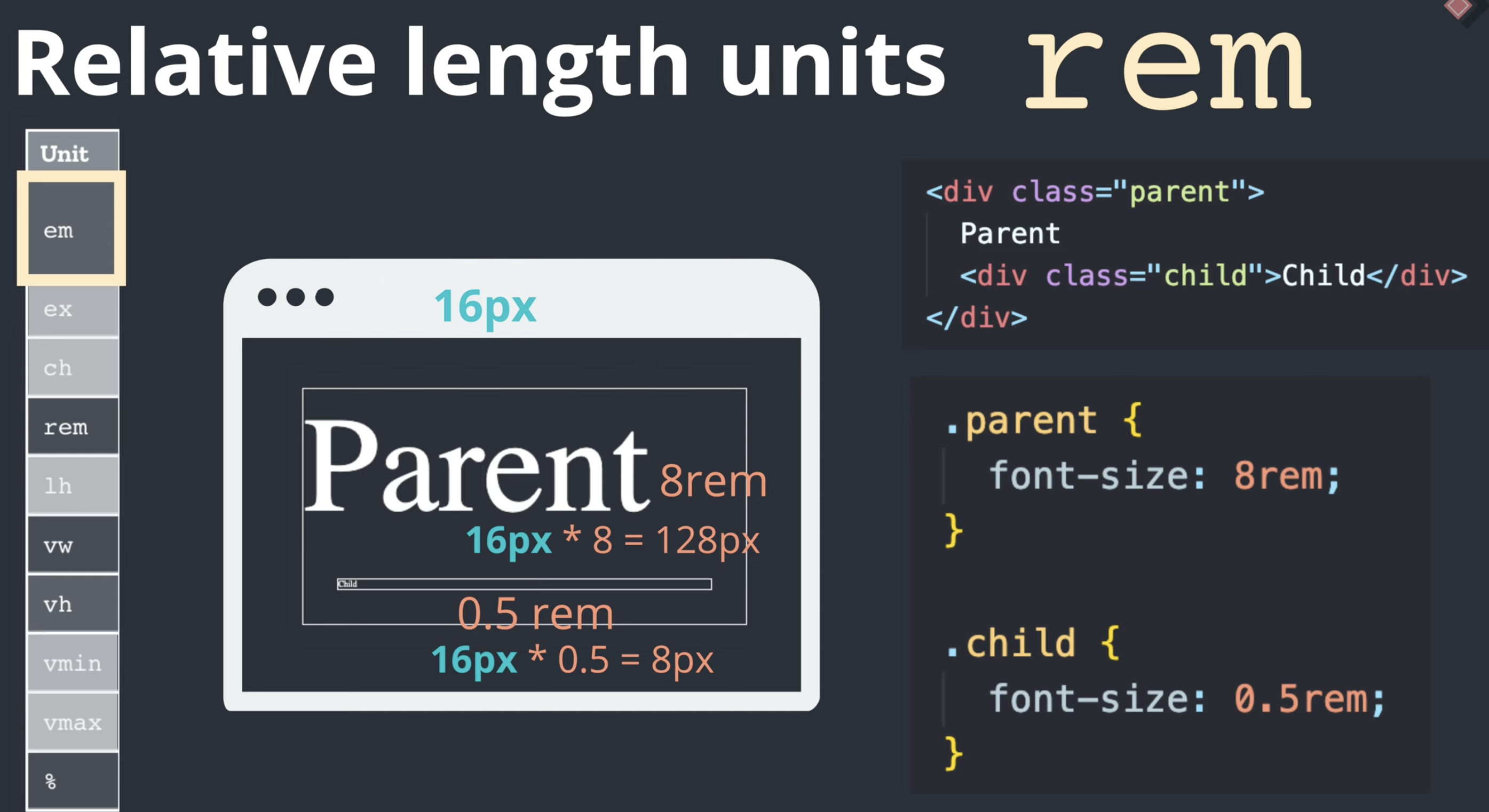
Comparing Units (specifically for font-size)
How and Why You Should Use ‘rem’ Units in Your Projects:
The rem unit is always in relation to the root font size, so if we set the root font size, other measurements can easily be changed on our page.
html {
font-size: 10px;
}
Now, note the default browser font-size is 16px but we are setting ours to 10px for easy calculations. So 10px equals 1rem, 45px will be 4.5rem. All we have to do is simply divide all the pixels by 10 and that’s our rem.
The only problem is by setting our root font-size to 10px we override the browser font size setting. Some users with bad sight do manually change their browser font size settings to have a bigger font size.
Setting the 10px font-size on our root removes the ability for these people to see our website properly because they can no longer change the default font size.
It will remain 10 pixels no matter the user’s default font-size, this is a bad practice. That is why we’re going to set our font-size to a percentage, which will translate to a percentage of the font-size given by the browser.
We are counting on the fact that the default browser font-size is usually 16px, and that remains the absolute default.
So let’s do simple math, if we put 100% here, this would mean that the root font size is 16 pixels.
All we have to do is to divide what we want which is 10, by 16.
10/16 * 100 = 62.5%.
Then that will translate to 10pixels which is what we want.


=> here 8em = 800%

Media Queries


Z-index
A z-index is a CSS property that controls overlapping HTML elements’ vertical stacking order, which appears closer to the viewer.
Elements with a higher index are placed on top of those with a lower one. Z-index works on most positioned elements, like absolute, relative, and fixed, but not static. The position property helps manipulate an element’s location.
Why Use the Z-index?
Elements can overlap for several reasons, such as when relative positioning nudges it, covering something else; a negative margin has pulled the element over another, or absolutely positioned elements overlap.
Without a z-index value, elements stack in the order that they occur in the DOM (the lowest one down at the same hierarchy level that appears on top). Elements with non-static positioning always appear on top of default static positioning. Also, nesting plays a significant role. For example, if element B sits above element A, a child element of element A can never be higher than element B.
CSS tips
one dimensional layout -> flex-box
two dimensional layout -> grid
set the breaking point of media query we will apply, and then what we would change

How to make hamburger icon

We can use 'a' tag href with other html item

Sources
https://developer.mozilla.org/en-US/docs/Web/HTML/Element/article#usage_notes
<article>: The Article Contents element - HTML: HyperText Markup Language | MDN
The <article> HTML element represents a self-contained composition in a document, page, application, or site, which is intended to be independently distributable or reusable (e.g., in syndication). Examples include: a forum post, a magazine or newspaper ar
developer.mozilla.org
https://uxdesign.cc/responsive-design-youre-doing-it-wrong-d88a52e1d5f7
Responsive Design — you’re doing it wrong!
Responsive design is not just about the web that automatically adjusts to different screen resolutions and resizeable images, but designs…
uxdesign.cc